Latest
Web apps & development
Graphic design
Communication
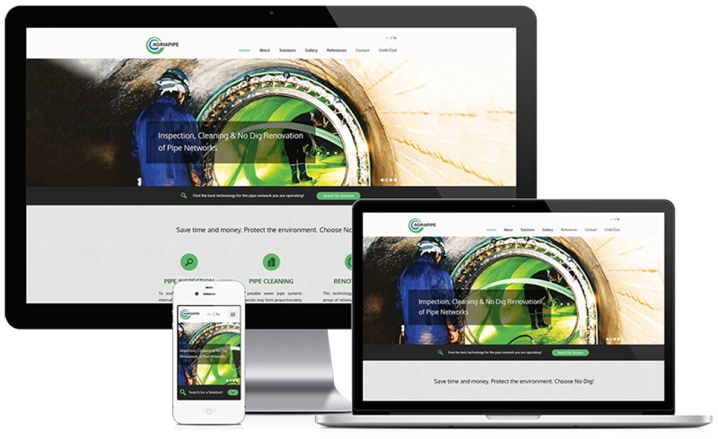
Agriapipe
Corporate identity redesign, website development
Client: AGRIAPIPE Ltd
Url: http://agriapipe.hu, http://agriapipe.com
Tasks: development | graphic design | webstorage
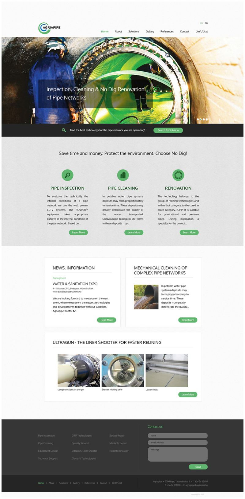
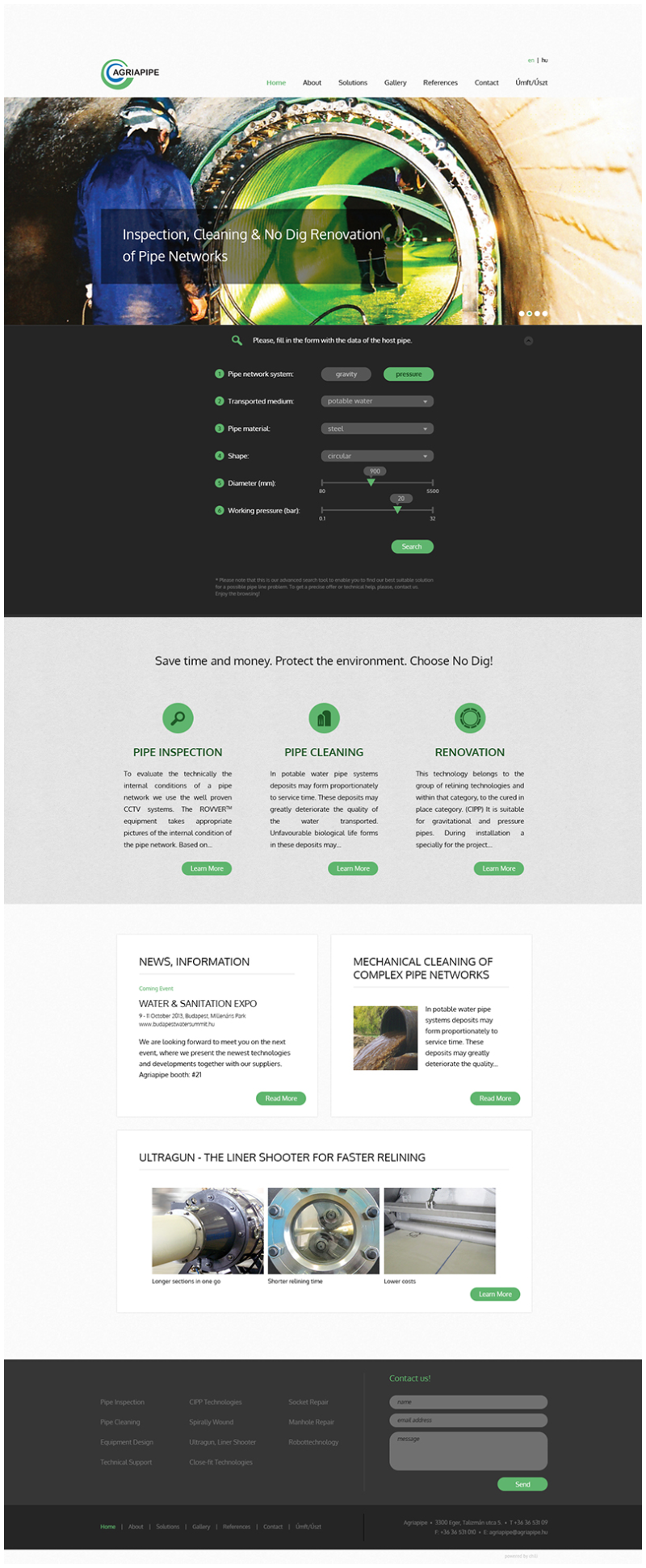
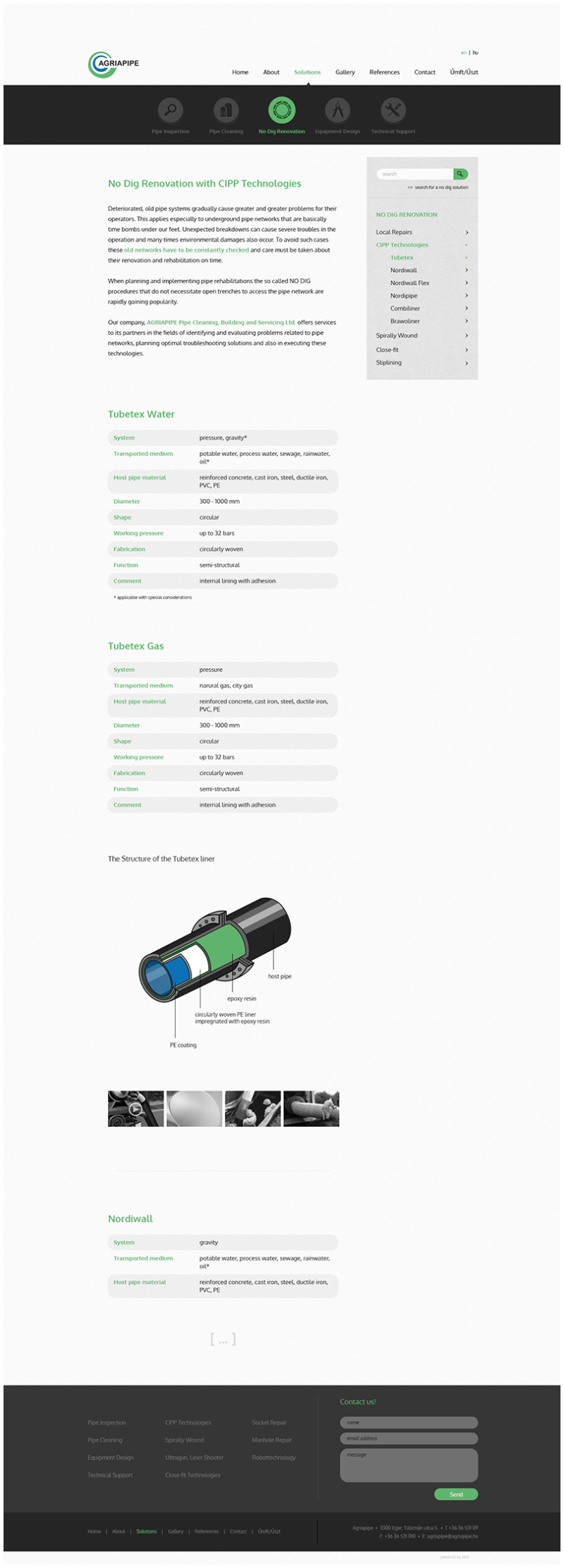
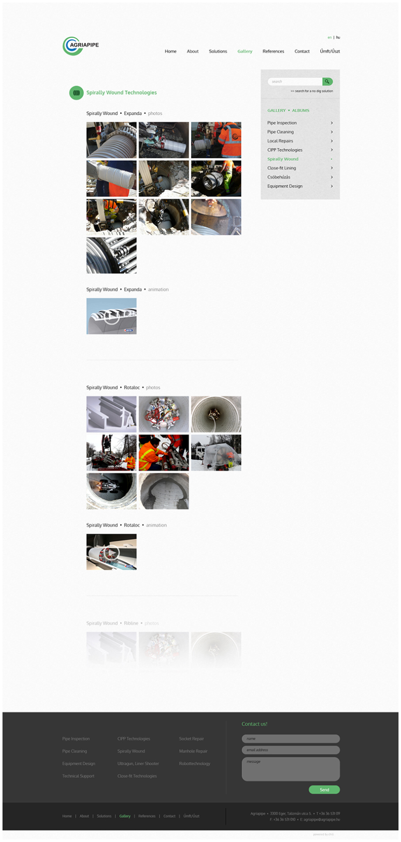
Website redesign & development:
- website with uniquely designed and developed desktop and mobile versions
- content can be flexibly managed from an administration site
- simple navigation within a complicated multilayered menu structure with a fun dashboard and submenu system
- floating side bar that follows the scrolling of the user and automatically highlights the submenu point when reached within the subpage
- easy-to-use contact form
- simple search tool that searches within the contents of the website
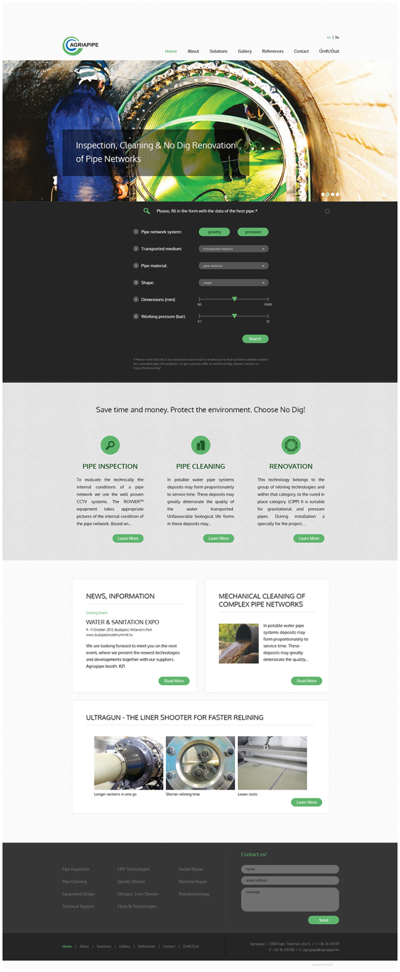
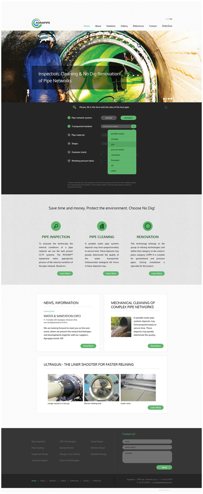
- uniquely developed advanced search application that helps the user find the most suitable pipe rehabilitation technology in a fun and easy way after feeding the application with the relevant technical data of the problematic pipe line
- mobile version is still under development
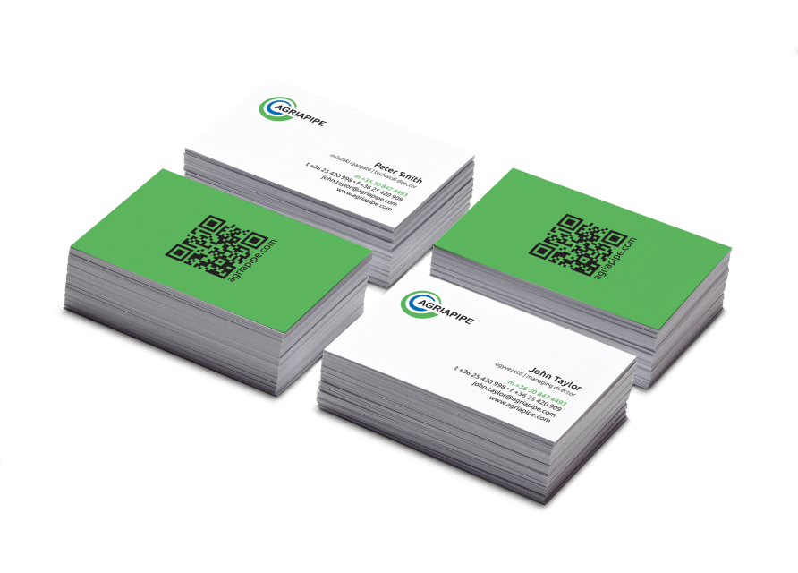
Logo design:
- the two curly lines represent a pipe renovated by a No-Dig pipe rehabilitation technology: a liner within the host pipe (green pipe: host pipe, blue pipe: liner)
- the colors of the logo are blue and green, where blue stands for water and gas - the two main business fields of the client - and green is used for the environment
- the round edged logotype is used to resemble pipes